/ Case study 03
City Hive · B2B SaaS dashboard · Shipped 2025
Analytics Overview for beverage retailers
Thirty numbers, no order, and half the business missing. The design problem was turning what the database stores into what a store owner needs to know.
Company
City Hive, beverage e-commerce
Role
Product designer: data definition, IA, data viz, UI, spec
Surfaces
Merchant dashboard, desktop + mobile web
Timeline
Shipped late 2025
Team
Scope from management, the dashboard dev team
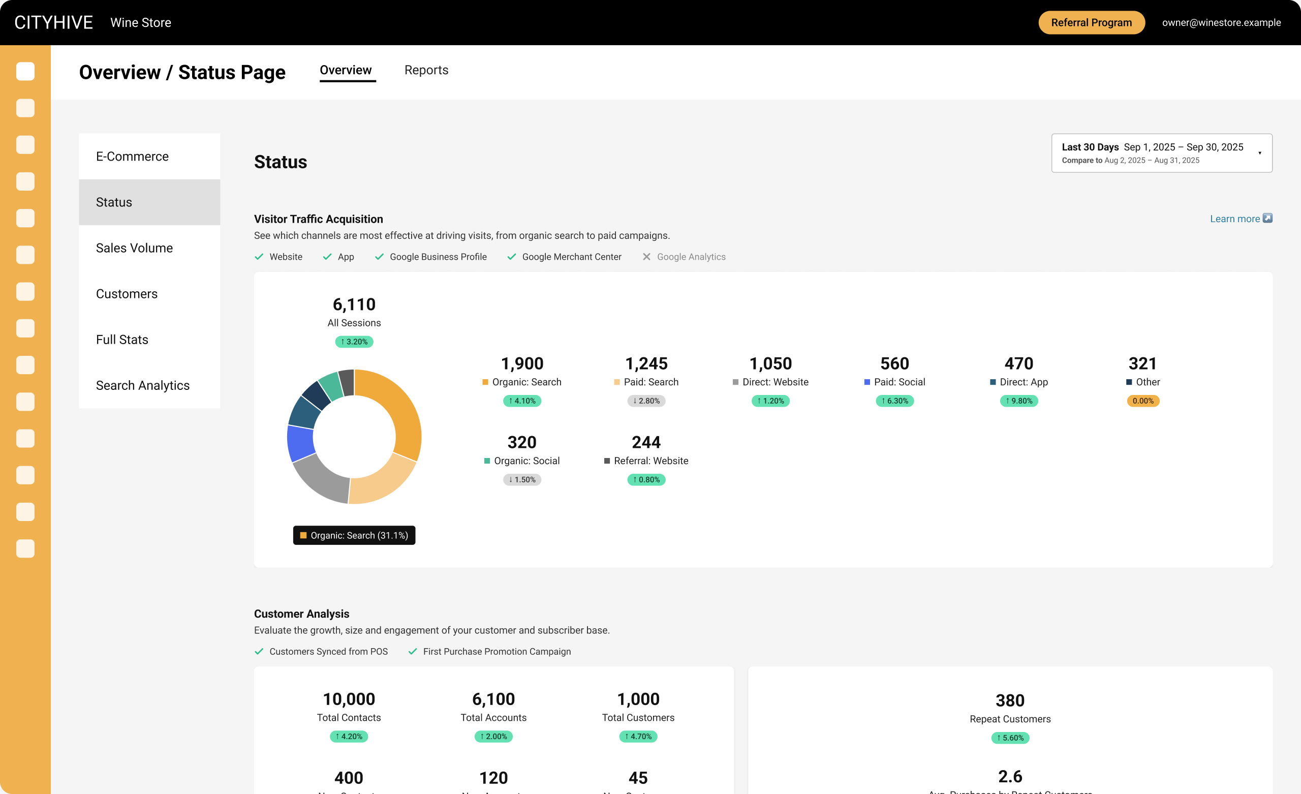
At a glance
The ask
“Goal is to create an advanced version of the Overview / Status page we currently have, in order to show more information and properly divide the information into categories that the user can understand without experiencing data dump.”
— The original ticket
Sales channels on the overview
Before: App and Website only
2 of 5
After: POS, Web, App, Marketplaces, Dashboard
5 of 5
In-store sales were often a store’s biggest channel, and the old overview didn’t show them at all.
Outcome
~36%
of all dashboard users opened the page, measured 28 days after launch.
On this page
01
Problem
The old Overview showed everything, and answered nothing
Merchants opened it to check how their business was doing. They got about 30 numbers at equal weight, grouped by where the data was stored, not by what they wanted to know.
Key insight
Merchants weren’t short of data. They were short of an order to read it in, and the channel that earned them the most wasn’t on the page.
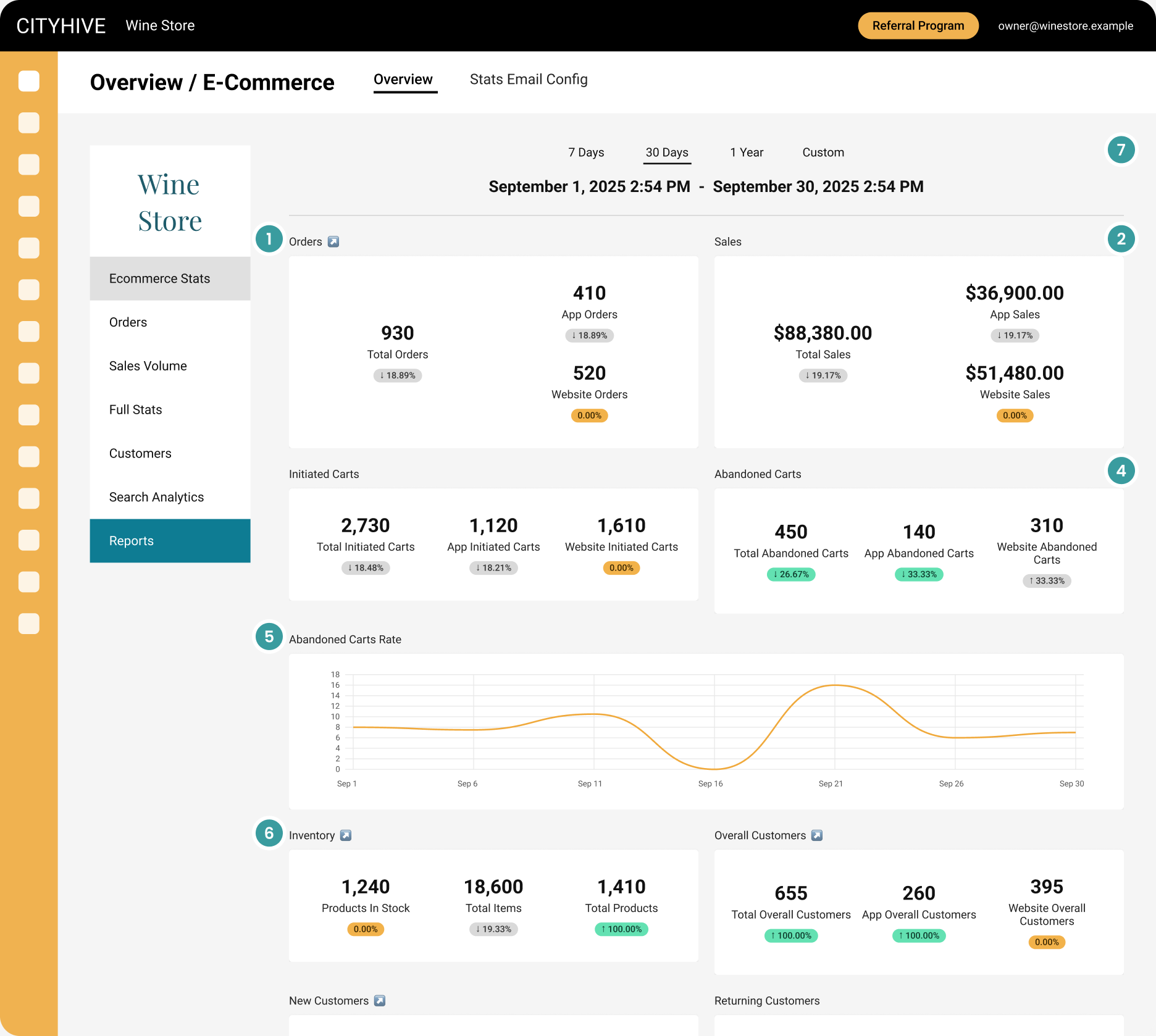
Before: the old Overview, mock data
1
Everything weighs the same
About 30 numbers in identical tiles, grouped by data type. Nothing says where to look first.
2
In-store sales are missing
“Total Sales” only counts App + Website. This store’s $94,300 in POS revenue, its biggest channel, never appears.
3
The data contradicts itself
Visitors show 0 / 0 / 0 while 2,730 carts were started. One obviously wrong number makes merchants doubt the rest.
4
Colours mean two things
Green means “good” on abandoned carts (↓) but “up” elsewhere. Grey and orange follow no stated rule.
5
Charts without meaning
No unit on the y-axis, smoothed curves that invent values between days, “0.2 customers” on another chart.
6
The wrong question
Stock levels sit in a performance overview. Inventory answers a different question.
7
Compared to what?
Every badge shows a change, but the comparison period is never stated.
02
Questions
I started from the questions, not the data
Recurring CS tickets showed merchants asking where to find things the dashboard already had. I rewrote the page around five questions a store owner asks, and gave each one a section.
Q1
Where are my visitors coming from?
→ Visitor Traffic Acquisition
Q2
Is my customer base growing, and do they come back?
→ Customer Analysis
Q3
Are my campaigns working?
→ Marketing
Q4
How much do people spend, and where do they drop off?
→ Shopping Cart Analysis
Q5
Where does my money come from, and what do I keep?
→ Sales & Revenue · Gross Margin
The original tickets aren’t available anymore. The questions are rebuilt from the recurring themes I worked from.
03
Structure
From 10 data buckets to 5 questions
The old page grouped numbers by what they were and only counted online channels. The new one groups them by what they answer, and adds the channels merchants actually sell through: in-store, marketplaces, campaigns.
Before: by data type
10 blocks, App + Website only
Orders · App · Web
Sales · App · Web
Initiated Carts · App · Web
Abandoned Carts · App · Web
Abandoned Carts Rate
Inventory
Overall Customers · App · Web
New Customers · App · Web
Returning Customers · App · Web
Visitors · App · Web
→
After: by question
5 sections, every sales channel, data sources shown
Visitor Traffic Acquisition
8 channels
Customer Analysis
funnel + repeat
Marketing
email · SMS · push
Shopping Cart Analysis
POS · web · app
Sales & Revenue
source · type · campaign
04
Decisions
What I chose, what I turned down, and what it cost
Three calls shaped the page. Each one traded something away.
1
Group the page by the question it answers
What I chose
Five fixed sections. Each opens with a one-line subtitle saying what it answers, so a merchant can skip straight to their question.
What I turned down
Keeping the flat grid and adding more tiles: more data, same dump. Or splitting by channel (Web / App / POS tabs), which makes merchants add the channels up themselves to see the whole business.
What it cost
A longer page. A fixed section order, with the most-checked sections on top, keeps the scroll predictable.
2
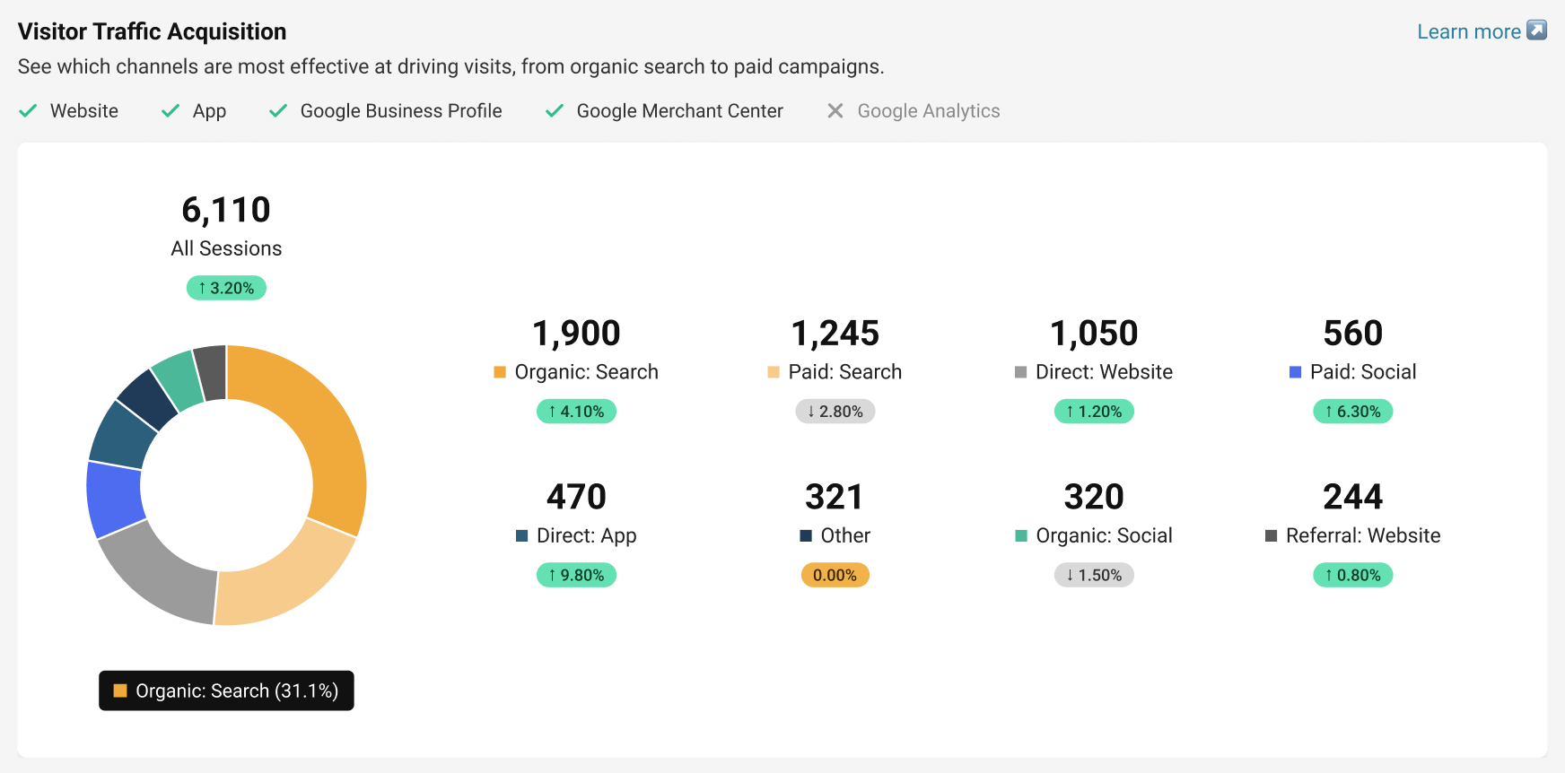
Show where each number comes from
What I chose
A row of connected / not-connected sources above every section. If Google Analytics isn’t connected, the merchant sees that before reading a misleading zero.
What I turned down
Hiding metrics with no source, which makes the page look different for every merchant and is hard for support to explain. Or showing zeros with no explanation, like the old page did.
What it cost
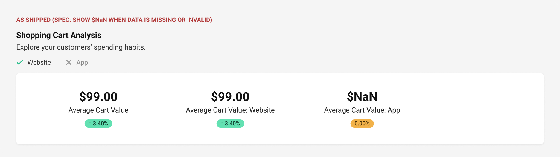
A row of grey ✗ shows a source is missing but not how to connect it. And the spec’s no-data / error state was a literal “$NaN”, which tells a store owner nothing. That’s the first thing I’d redesign (05).

3
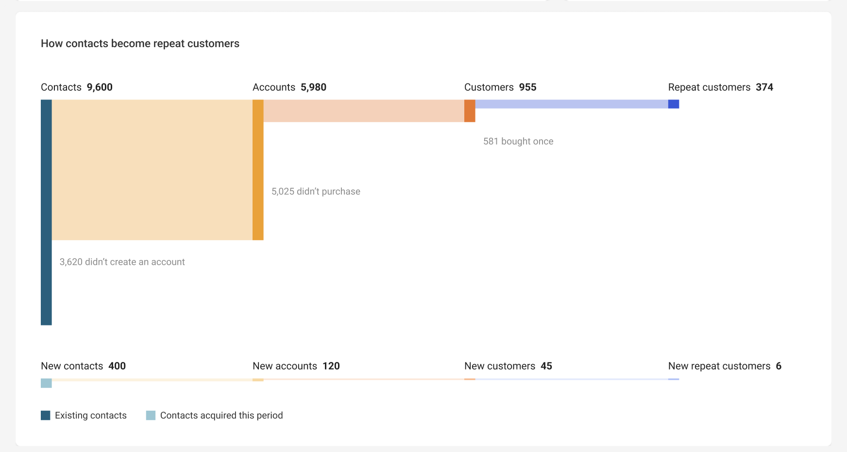
Show the customer funnel as a Sankey, split into existing and new
What I chose
The spec asked for one linear path: contacts → accounts → customers → repeat. I split every stage into existing contacts and contacts acquired this period, so a merchant sees “is my base converting?” and “are the people I just acquired converting?” in one view.
What I turned down
Number tiles only, which give no relationship between the numbers. Funnel bars, which can’t show two groups without two charts. Two funnels side by side, which take twice the space and are harder to compare than one flow.
What it cost
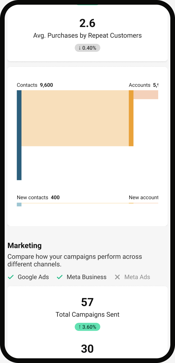
Small flows become hairlines (6 new repeat customers barely shows), so labels carry the meaning and the exact numbers stay in the tiles above. On a phone I kept the chart at full width inside a horizontal scroll instead of shrinking it.
05
Edge cases
Most stores don’t have every channel connected
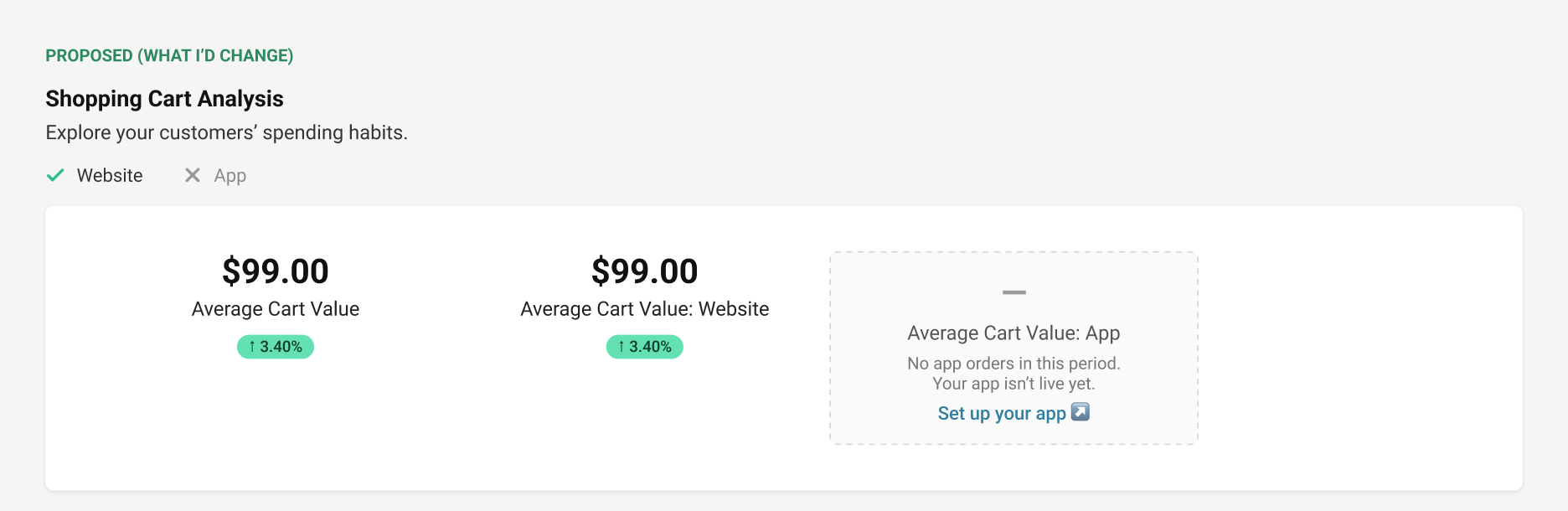
A store with no app, no Google Analytics or no POS sync is the normal case. The spec required a visible state when data was missing or invalid, and that state was “$NaN”. It met the requirement, but a merchant can’t tell “not connected” from “nothing sold” from “something broke”.
What I’d do now
Split “$NaN” into three states a merchant can act on. Not connected (with a setup link), no activity in this period, and a data error (with retry or support).
Mobile
On mobile
Everything stacks into one column in the same order as desktop, one metric per row with its change badge, so nothing is truncated. Bar charts shrink to the phone width. The Sankey is the exception: it keeps its full width inside a horizontal scroll, because squeezing it would turn the small flows into nothing.
06
What shipped
Merchants found it in the first month
Source: Google Analytics, shared as percentages by a former colleague after I left. There’s no clean before/after against the old page, so these show adoption and engagement over time, not a lift over the old design.
What the numbers showed
Monthly reach
~36%
of all dashboard users opened the page in the first 28 days after launch.
Time per user
+17.77%
average engagement time per active user on the page vs. the launch month. More time can mean more reading or harder searching, so I treat it as a signal, not proof.
Share of views
2.96%
of all dashboard page views went to this one page in the same 28 days.
07
Reflection
What I’d take from this
Do differently
Define success before launch, not as time on page
I’d set a task metric up front, like how fast a merchant can answer “which channel drove most revenue?”, plus a counter-metric such as support tickets about wrong numbers.
Learned
Treat the error state as a design surface
“$NaN” met the requirement, but it’s a developer’s word. Missing data needs its own states: not connected, nothing this period, and a real error.
Do differently
One rule for change colours
Green should always mean “good for the business”. Fewer abandoned carts is good, so it’s green with a down arrow. The old page mixed direction and meaning; the new one only partly fixed it.